The Wey Valley School & Sports College
Mathematics Home Study
UNIT: Data Handling
Support work: Question 1 on each page
Core work: Question 2 on each page
Extension work: Question 3 on each page
REMEMBER:
A stem and leaf diagram is a way of organising a set of data.
The tens or hundreds are usually the stems and then the digits are the leaves e.g. for the data: 23, 25, 36, 21, 34, 22, 37
KEY:
3 / 4 / Represents 34 / Now put in order
2 / 3 / 5 / 1 / 2 / 2 / 1 / 2 / 3 / 5
3 / 6 / 4 / 7 / 3 / 4 / 6 / 7
Median: Put the data in order and choose the middle value (if there are 2 middle values, add them together and divide by 2)
If you have ‘n’ pieces of data then the median = (n + 1)th value.
2
So in the example above the median is (7 + 1) → 4th value = 25.
2
To find the quartiles you have to divide the data into quarters in the same way as you divide the data in half for the median.
Range = highest value – lowest value
Interquartile Range = upper quartile – lower quartile
Mean = add up all the values and divide by how many values there are
Mode = most common value / Page 1
STEM & LEAF DIAGRAMS
1. The heights of 30 plants, each measured to the nearest cm, are listed below:
47 / 63 / 42 / 38 / 71 / 66 / 63 / 42 / 49 / 51
53 / 44 / 47 / 52 / 54 / 65 / 70 / 72 / 67 / 69
49 / 50 / 51 / 57 / 59 / 68 / 74 / 71 / 63 / 65
Illustrate this data with a stem and leaf diagram
2. The grower decided to change the fertiliser they were using
and measured the height of the next 30 plants:
75 / 32 / 28 / 65 / 61 / 75 / 32 / 79 / 31 / 28
78 / 22 / 23 / 51 / 68 / 67 / 72 / 74 / 34 / 39
64 / 26 / 21 / 78 / 79 / 72 / 35 / 36 / 34 / 72
a) Draw a stem leaf diagram for this set of data and compare it to the data in question one.
b) Comment on whether you think the grower should continue with the new fertiliser – give your reasons.
3. Draw a back to back stem left diagram for the two sets of data.
a) Find the following and comment on the differences between the two fertilisers.
i) the medians
ii) the ranges
iii) the interquartile ranges
b) Taking the above 3 measures into consideration should the grower continue with the new fertiliser? Give your reasons.
Page 2
CORRELATION
12 students gain the following marks in their English & Maths tests.
Student / 1 / 2 / 3 / 4 / 5 / 6 / 7 / 8 / 9 / 10 / 11 / 12
Maths / 4 / 14 / 28 / 22 / 26 / 6 / 18 / 22 / 11 / 8 / 24 / 14
Eng / 6 / 16 / 10 / 12 / 29 / 26 / 14 / 14 / 17 / 22 / 18 / 22
1. For the Maths results, then the English results:
a) Calculate the mean
b) Find the median
c) Write down the mode
d) Find the range
2.
a) Draw a scatter graph for the results
b) Describe any correlation between the two results
3.
a) On your scatter graph from question 2 draw a line of best fit
b) The 13th student only sat the English test and gained 25 marks. Use your line of best fit to predict how many marks you would you expect them to get on the Maths test.
c) What is the equation of the line of best fit? / Page 3
PIE CHARTS
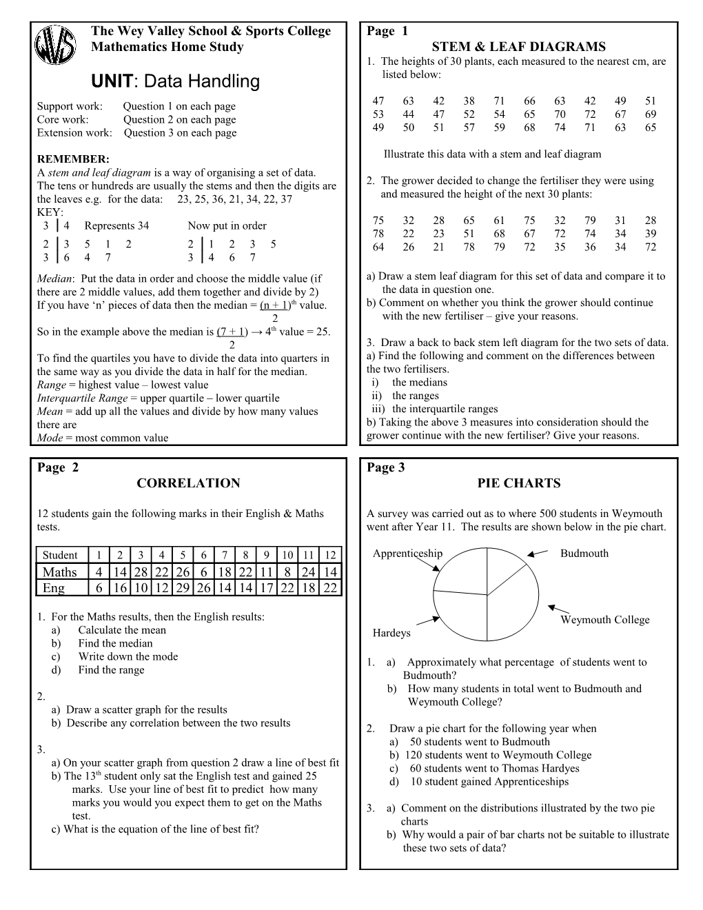
A survey was carried out as to where 500 students in Weymouth went after Year 11. The results are shown below in the pie chart.
Apprenticeship / / / Budmouth
/ Weymouth College
Hardeys
1. a) Approximately what percentage of students went to Budmouth?
b) How many students in total went to Budmouth and Weymouth College?
2. Draw a pie chart for the following year when
a) 50 students went to Budmouth
b) 120 students went to Weymouth College
c) 60 students went to Thomas Hardyes
d) 10 student gained Apprenticeships
3. a) Comment on the distributions illustrated by the two pie
charts
b) Why would a pair of bar charts not be suitable to illustrate these two sets of data?
The Wey Valley School & Sports College
