Navigating the Sustainability Plane with ImPACT Oct 11, 2003
Transforming nebulous sustainability into a visible plane.
From its beginning humanity has labored to improve its lot in the direction of higher income, more seeds in a cave or more dollars in a bank. During the 20th century, humanity’s striving took the name economic development. Then as population multiplied and mechanical muscle strengthened, humanity began worrying about the blows it was striking on the surroundings. In the USA, the words logging and Teddy Roosevelt’s forest service, the plow that broke the plains and Franklin Roosevelt’s soil conservation service, and smoggy skies and Richard Nixon’s EPA evoke the century of deepening worries and hopeful responses.
Despite deepening environmental worries, when the UN in 1982 planned the World Commission on Environment and Development that took Chairman Bruntland’s name, the organizers decided that considering environment alone would be a grave mistake. Attempts to defend the environment in isolation from human concerns gave the very word “environment” a connotation of naivety in some political circles, Bruntland wrote. Nevertheless, she added that “environment” is where we live, and development is what we do to improve our lot within that abode. The Commission’s solution was to join the new dimension of environment with the enduring dimension of income in sustainable development. The Commision defined sustainable development by the dual specifications of 1) meeting the needs of the present and 2) not compromising the ability of future generations to meet their own needs.[1]
By giving sustainability the twin dimensions of income and environment the Commission moved beyond both one-dimensional economic development and one-dimensional environmental control. By stipulating two dimensions they defined our common journey[2] to sustainability as a pilgrims’ progress across a plane. We can give the plane tangible longitude marked in dollars of income and concrete latitude marked in tons of environmental impact (Chart 1). Income increases from left and poor toward right and rich. Impact rises from clean at the bottom to dirty at the top. Hell lies in the top left or DP corner of the plane, heaven in the lower right CR. On the Chart we can map a national pilgrimage. If the variables of population, affluence and technology in the IPAT identity[3] are independent and only A changes, the nation will head straight toward the dirty and rich corner DR as income rises, making the sustainability of steady or less impact impossible. If the national pilgrimage is instead an arc, first toward rich and dirty but then curving toward rich and clean, the arc will be called an environmental Kuznets curve.[4] As a nation moves across the longitudes of income, we can chart its excursions up and down the latitudes of environmental impact on a chart of the sustainability plane. The income and environment that might have been thought of as competitors become instead two directions, and what might have been a vague discourse becomes a chart before our eyes.
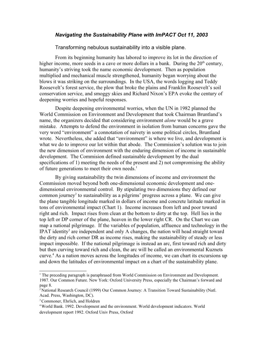
A century of SO2 emission from the USA.
If we can chart the journey with concrete latitude and longitude, then we can name the actors and measure their leverage as they steer the nation’s pilgrimage across the plane. With the usual provisos for generalization, we identify four actors. Parents change population, workers raise the population’s income, consumers choose the income’s expenditure on consumption, and producers alter the impact of the consumed goods on the environment. With balanced units, the ImPACT identity first shows the actors’ leverages and then combines them into national impact. As income changes, the identity shows how to combine the actor’s separate leverages on the tiller into impact and so the direction of the pilgrimage across the plane.[5]
Im national impact = P population A GDP/person C consumption/GDP T impact/consumption.
We call A income, C consumption or intensity of use and T technology. When P, A, C and T are transformed into logarithms, they add to the logarithm of impact.
ln(Im) = ln(P) + ln(A) + ln(C) + ln(T).
Before mapping a pilgrimage on the sustainability plane, we first illustrate how the logarithms of P, A, C and T add on the familiar coordinates of a time line or course (Chart 2). The time line shows the characteristics of SO2 emission in the USA during the Twentieth Century, year by year. The vertical scale of logarithms rises from 1 times the 1900 level to a logarithm of 0.7 when the variable is twice or 2 the 1900 level, and so forth. Or the logarithm falls to minus 0.7 when the variable is half or 1/2 the 1900 level. The logarithmic scale has the advantage of showing how the contributions of P population, A income, C consumption of power per GDP and T emission of SO2 per energy add to the logarithm of the product P A C T. PACT equals the Im national impact of tons of SO2 emitted. During the century, population roughly quadrupled and income multiplied 8. Fortunately for the environment, after national emission tripled to a maximum in 1970, consumption and technology, especially T emission/energy, countered rising population and income, lowering national SO2 emission nearly to Depression era levels—but without the Depression’s pain. The Chart quantifies the contributions labeled P, A, C and T of each class of actors—parents, workers, consumers and producers—during the century. As workers lifted income until the Depression intervened, impact also increased. The Depression lowered income and with it the impact of SO2 emission. As income rose after 1970, however, consumers and producers lowered emission, causing impact to follow falling C and T downward rather than to follow rising A upward to dirtier on Chart 2.
Whose leverage steers a nation on the plane of sustainability?
Now, a journey on the plane of sustainability. On Chart 3 the distance from clean to dirty is the latitude of environmental forces and impact, plotted on a logarithmic scale so the logarithms of P, A, C and T still add to national impact as they did in Chart 2. The axis from left to right, however, has changed from the years of Chart 2 to the longitude of income running from poor on the right to rich on the left of Chart 3. Income A has been omitted from Chart 3 because it would rise in a straight and thus uninteresting line from ln(1) or 0 on the left to ln(4) or 1.4 when income reached 4 the 1900 income. Although logarithmic in dollars, the horizontal scale is an arithmetic scale of utility, which Daniel Bernoulli (1738) wrote was proportional to logarithmic rather than arithmetic dollars. Doubling income from $20,000 to $20,000 increases utility as much as doubling from $20,000 to $40,000. The uniform distances between points on the time line become variable on the plane of sustainability, where the longitudinal distances between data on the plane depend on the rate of change of income. For example, the rapid recovery of income near 1940 stretched the distance in income latitude on Chart 3. In contrast to the stretching of the 1940s, the Great Depression and post WWII recession actually reversed the movement of data points back toward poor. The stretching and reversal of population’s data points dramatize the reversal and stretching that changing from units of time to units of income on the horizontal axis of the sustainability plane.
At the low incomes of the early decades of the century, small values of consumption C and technology T did not counter growing values of P and A that steered SO2 emission toward dirty. At intermediate incomes, consumption and technology damped the leverage of population, and at still higher incomes, more conservative consumption and especially better technology countered population and income to steer the nation toward less emission.
For places with 300-fold differences in income, the World Bank drew a dramatic Kuznets arc of 5-fold rise and fall of urban SO2 concentration. Although less dramatic, the 3-fold rise and then fall of SO2 emission from the USA with an 8-fold change of income during a century can also be said to follow a Kuznets curve on the sustainability plane. Charting P, A, C and T in addition to impact emphasizes the difference between earlier, poorer and recent, richer declines of SO2 emission. In poorer times, recessions pulling income left along the longitude of income twice pulled emission toward clean and poor. Beyond richer than 4 1900, however, conservative consumption C and improving technology T pulled emission toward clean and rich without recession.
Changes for richer or poorer, dirtier or cleaner on the sustainability plane
Examining change opens an even more dynamic view than mapping paths. Let lower case letters symbolize annual rates of change of the logarithms, which we call leverage.
i = p + a + c + t
For the typically slow annual changes of the variables, annual percentage can be substituted for logarithmic change. Movement across the longitude on the plane is a %/yr and across the latitude is i %/yr. Averaged over the twentieth century, workers carried the nation across the environmental latitude of income at 2.1%/yr, while the net leverage of p, a, c and t carried the USA across environmental latitude of SO2 emission at only 0.6%/yr. The four leverages add the impact.
p + / a + / c + / t = / i1900/2000 / 1.3% / 2.1% / -1.1% / -1.7% / 0.6%
Although a century span can illustrate the additive nature of the four leverages, its long span obscures the most striking excursion on the sustainability plane of Chart 3. The bars of Chart 4 show that during 1900/1970 when incomes were poorer than about 4 1900 income, the leverages translated riches into more impact on the sustainability plane. During 1970/2000 when income was richer than at the turning point of 4, however, the leverages decreased impact as riches grew. Population lessened its leverage a little, but consumers and producers exerted heavy leverage. Consumers grew more conservative at nearly 2%/yr, and producers improved technology at more than 3%/yr. The net was movement in one of the dimensions of sustainability, toward riches faster than 2% /yr, while impact was moving in the other dimension toward cleaner at nearly 2%/yr. During 1900/1970 the bar in Chart 4 representing impact was in the dirtier direction above 0 but during 1970/2000 went in the cleaner direction below 0.
Direction on the sustainability plane?
In one dimension, say, single-minded economic development, only speed a%/yr matters. On the sustainability plane, however, direction matters as much as speed. As a reference, take the straight line of increasing income without changing impact. The direction of impact reckoned as the tangent to the reference line is then i/a. If a nation grew richer with unchanging impact, its direction would be 0. If instead it’s impact grew in proportion to income, its journey would head to richer and dirtier with a direction i/a of 1.0. Direction i/a is the net direction caused by the four leverages:
i/a = p/a + a/a + c/a + t/a = p/a + 1 + c/a + t/a
The average directions over seven decades before and three decades after 1970 again exemplify the journey. When 1 for a/a is added, the average directions of p/a, c/a and t/a tabulated below sum to the direction i/a of impact. The two time spans show how the conservative consumption and better technology indicated by changed c/a + t/a threw over the tiller. The two changed the heading i/a of impact on the sustainability journey taken by the USA. Instead of heading toward the rich and dirty direction RD at 0.8, the journey headed toward the rich and clean of RC at minus 0.9.
1900/1970 / 0.7 / -0.3 / -0.5 / 0.8
1970/2000 / 0.5 / -0.9 / -1.4 / -0.9
Headings or tangents like c/a on the sustainability plane indicate the percentage change of, say, consumption of energy per change of income. Economists call such relative change income elasticity. The implication is that 1% more income would combine with an elasticity c/a of minus 0.3 to decrease consumption c by 0.3%. Because changing energy consumption per capita is (a+c), the heading or elasticity of per capita consumption during 1900/1970 was (a+c)/a or 0.7, a reasonable elasticity for a necessity and one that could reflect cause and effect. Although the consumption and income did change with that ratio from 1900 to 1970, assuming riches would change population, consumption, technology and thus impact by the headings or elasticities above would be reckless. An implication that doubling income would speed population growth by 70% as implied by the 0.7 p/a for 1900/70 contradicts common sense. Further, the differences between the first and second time spans above deny the working of a universal law. Nevertheless, because income surely matters, we dig deeper.
A continuum of income and the other leverages was calculated for 1900/1910. 1901/1911,…, 1989/1999, 1990/2000. During decades before 1970, income fell as rapidly as 2%/yr and rose as rapidly as 9%/yr, a wide range of conditions to examine for the relative changes of c and t versus a. Regression of decadal changes of c on a did show a significant elasticity c/a of minus 0.3 but no significant elasticity t/a. A significant but small elasticity for p reflected slower population growth when income rose. No significant elasticity was found for t. The impact i produced by the leverages displayed a significant elasticity i/a of 0.7. Elasticity plus glimpses at the time course and sustainability plane all support the conclusion that before 1970 boom and bust steered consumption and so national emission.
Since 1970 the changes tell a different story. Changes of GDP ranged only from 1 to 2%/yr. Over this range, no significant correlation of decadal changes of other variables to income could be found. So during the first seven decades, the headings of the national journey on the sustainability plane were levered toward rich and dirty by income tempered by an elasticity less than 1 for consumption. During the three decades since, changes in consumption and technology, coincident with enrichment but not clearly related to income from decade to decade, carried the nation toward richer and cleaner. The fall of impact’s income elasticity from positive to negative directed the arc on the sustainability plane that we call Kuznets. The ImPACT identity dissected its causes.
A century of cropland in the USA.
Unlike SO2 emitted to the sky where it can become sulfuric acid, cropland converting sunlight into food and feed is a blessing. Nevertheless, because the more cropland, the less spared for Nature, one can consider expanding cropland an environmental impact. If we set out to spare land, then the levers steering a nation across the sustainability plane again begin with parents and population and with workers and income. On the new journey, however, the consumer’s lever is crop per GDP, and the producer’s lever is land area per crop. Charts 2 and 3 already show how P and A changed during the 20th century, and only C and T are new. To reckon C we might measure crop as usual in tons of grain. Nonetheless a price-weighted index of all crops grown[6] serves our purpose better. First, it encompasses all crops, and second, it credits changes from less wanted to more desired crop production. The index does not encompass the marketing bill, the difference between farm and retail value. To measuere cropland, we choose cropland used because it encompasses failed crops that subtract from land as much as land harvested.
Before we draw the first chart, we expect that on the sustainability plane the new C crop/GDP will head toward the cleaner of more conservative consumption. Ernst Engel’s 1857 observation that the percent spent on food declines as household income rises and enshrined in a law named for him predicts C will head toward more conservative. And Chart 5 confirms that prediction.
The behavior of T cropland/crop can also be anticipated. Farmer’s well-known improvement of crop yields decreases the land to grow a unit of crop, lowering T as Chart 5 confirms. We have called the product of P A the sustainability challenge to consumers and producers. Despite the 4-fold multiplication of population and 8-fold multiplication of income combining into a 16-fold sustainability challenge during the 20th century, the team of consumers and producers kept cropland area with leverage of C and T met the challenge. Despite burgeoning population and wealth, they held the PACT of national cropland area from heading toward dirty on the sustainability plane, Chart 5.
What headings constituents of the countering team, the consumers and producers, take? The median income on the journey toward richer on Chart 5 was 1.1 on the logarithmic scale or about 3 1900 income. At incomes less than that the C consumption course headed toward cleaner somewhat more than at richer incomes. The farmer’s T technology course, on the other hand, seemed to head somewhat more toward cleaner at incomes greater than less than the median.
As in our examination of the journey of SO2 emission, we compiled the continuum of decadal changes 1900/1910. 1901/1911,…, 1989/1999, 1990/2000. The twin panels of Chart 6 graph first the rate of change of C versus A and then of T versus A. That is, we graphed c and t as functions of a, where the slope of the function is elasticity. The values for income above and below the median are colored differently, blue below the median level and pink above. As for SO2 emission, the greater range of a during the poorer incomes of early years makes elasticity easier to discern than during the richer years. The income elasticity of c was about minus 0.6 during the poorer years and minus 0.9 during the richer years. Corresponding to 0.4 to 0.1 income elasticity for per capita food production, this is a believable range for income elasticity in a relatively rich country. The range of elasticity means $1 more income, 40 cents more food produced during the poorer years but only 10 cents more during the richer years.